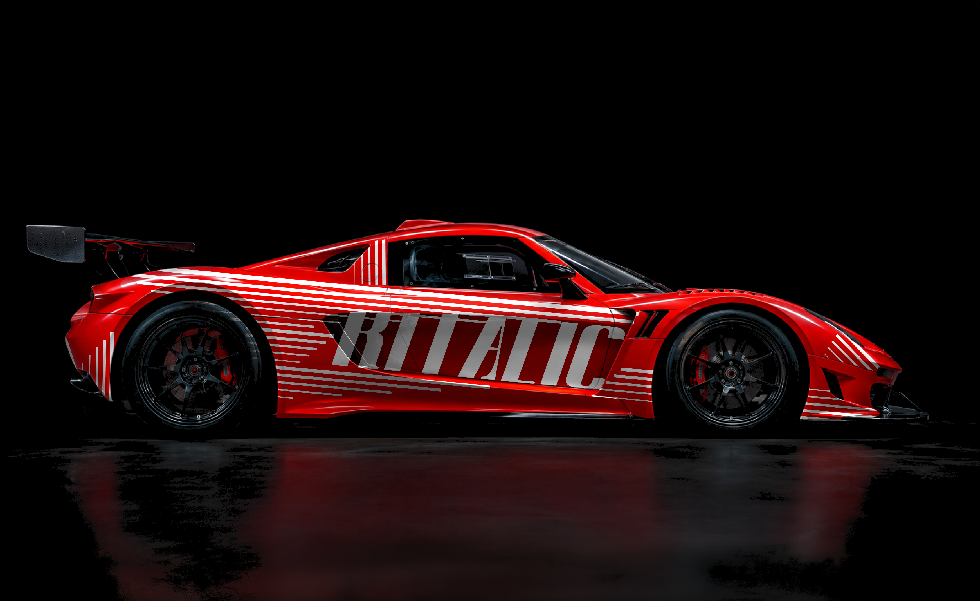
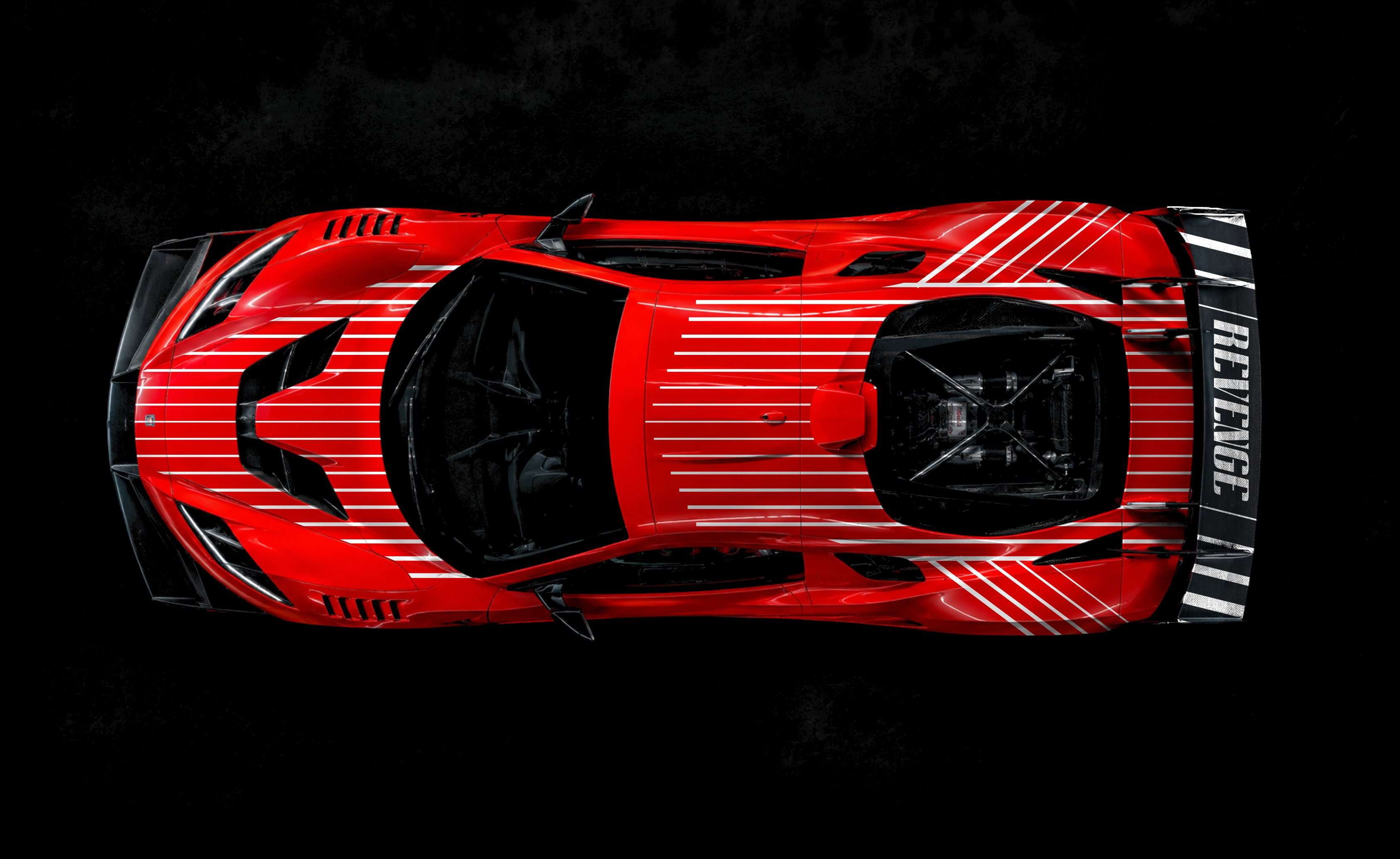
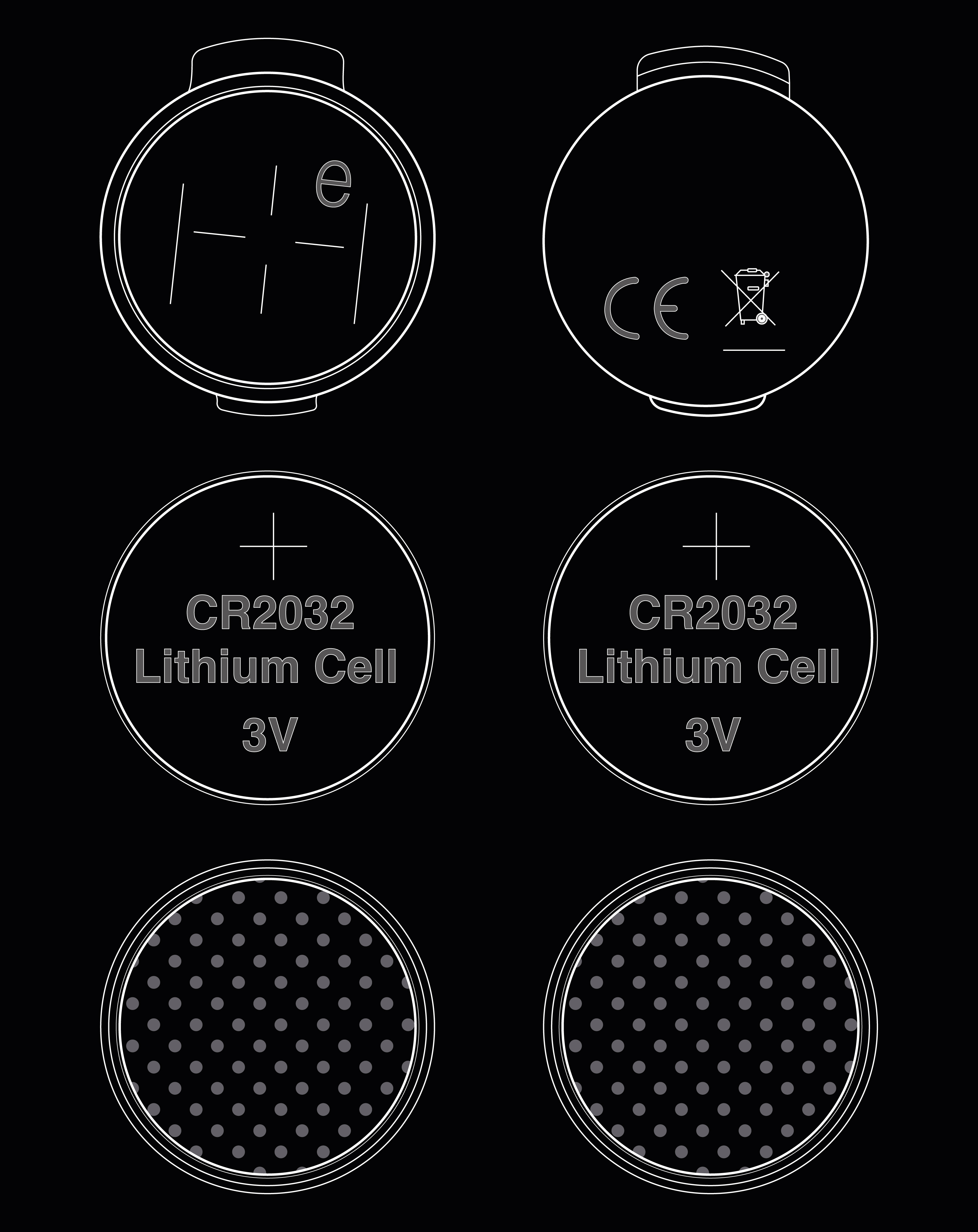
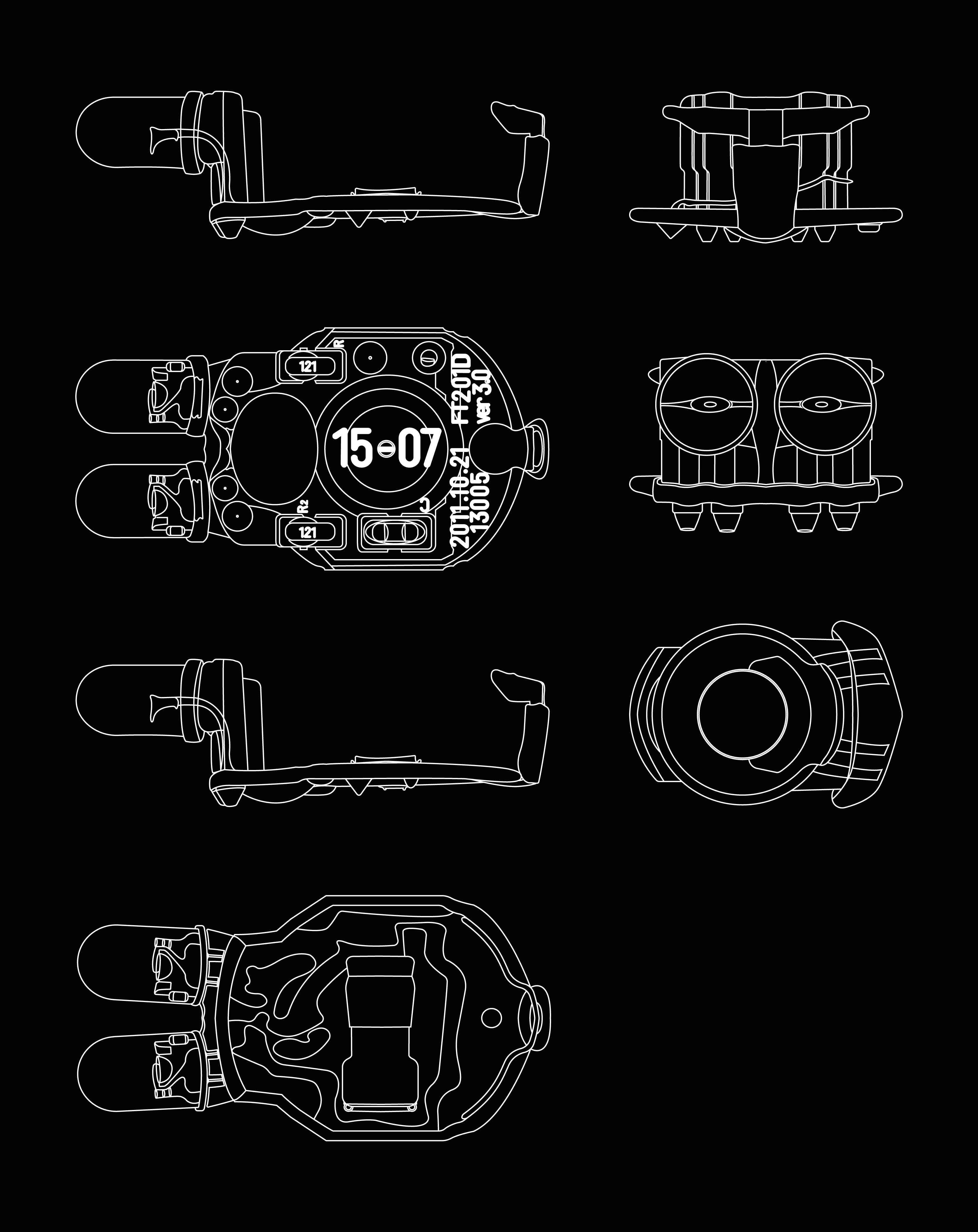
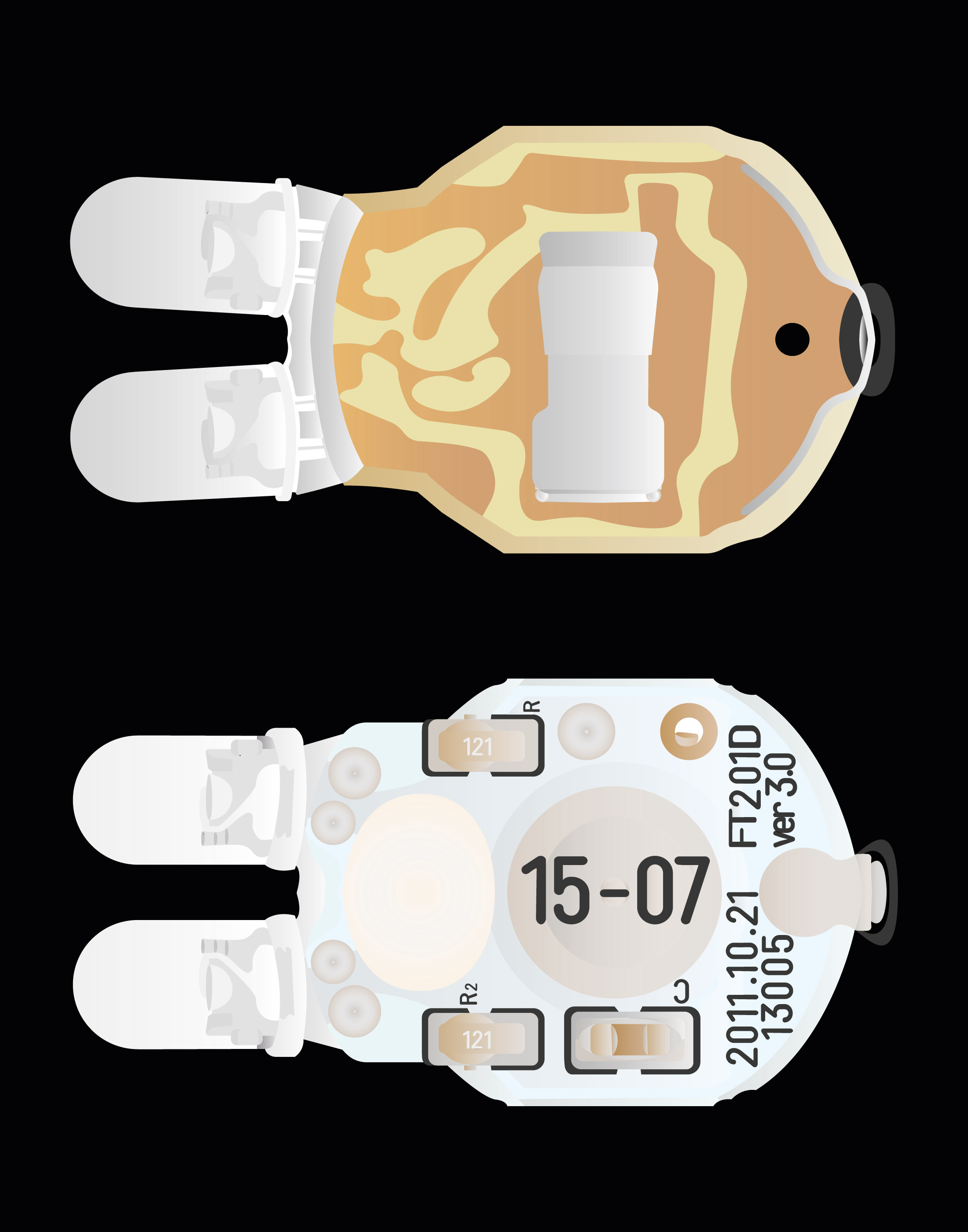
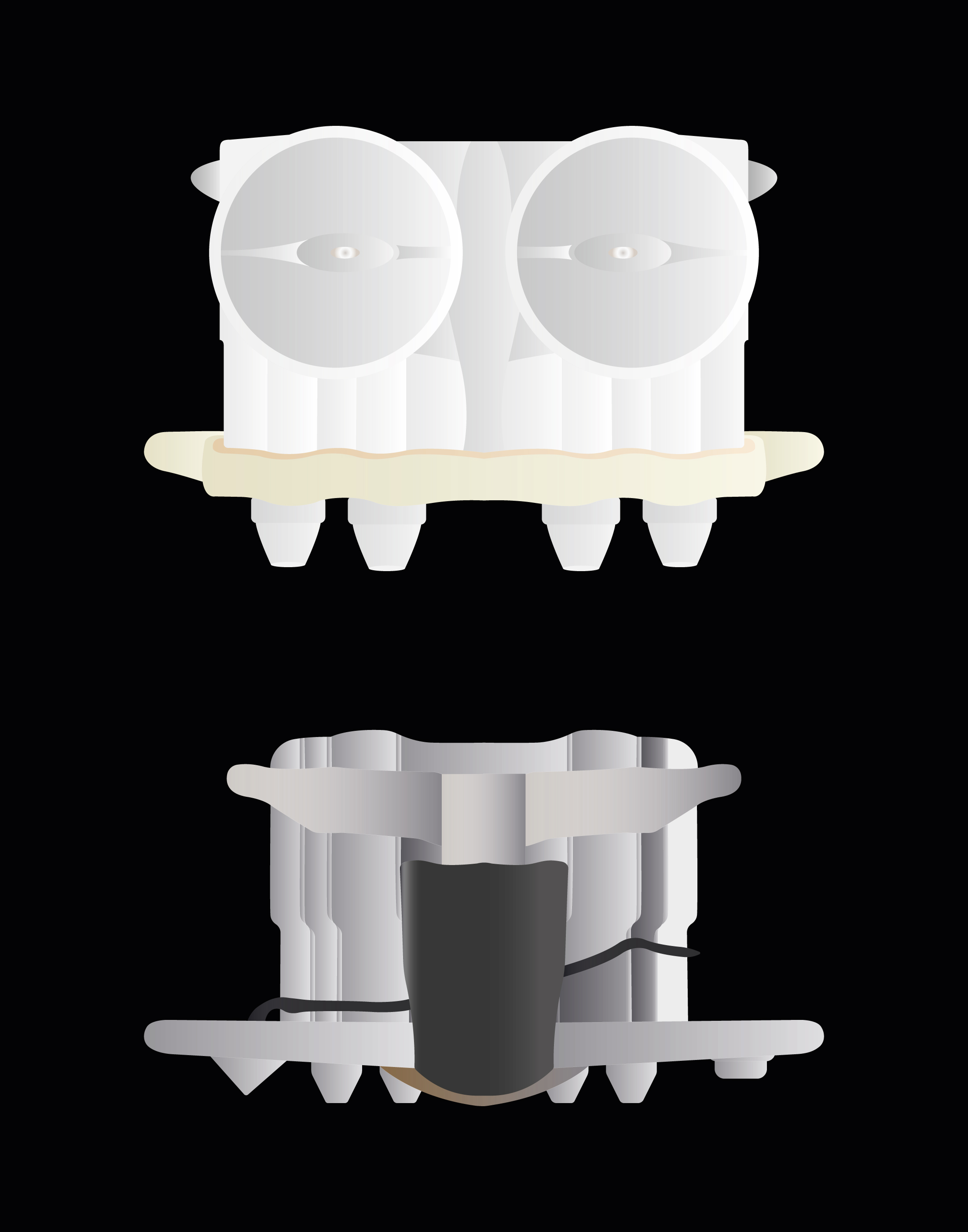
Over the course of two weeks, I learnt to use Glyphs and created my own typeface. The foundation was a grid I had developed from a deconstructed bicycle lamp. The result was “Revenge”, a static, block-like grotesque typeface family comprising three styles: Roman, Ritalic and Italic. It is particularly well suited to headlines and posters. The name reflects the design process: although my initial design felt static, breaking free from the rigid grid resulted in a more dynamic visual character.
2022
1ST YEAR
VOCATIONAL TRAINING
FACHKLASSE GRAFIK
LUZERN